Sports Club
UI Revamp with better User Experience
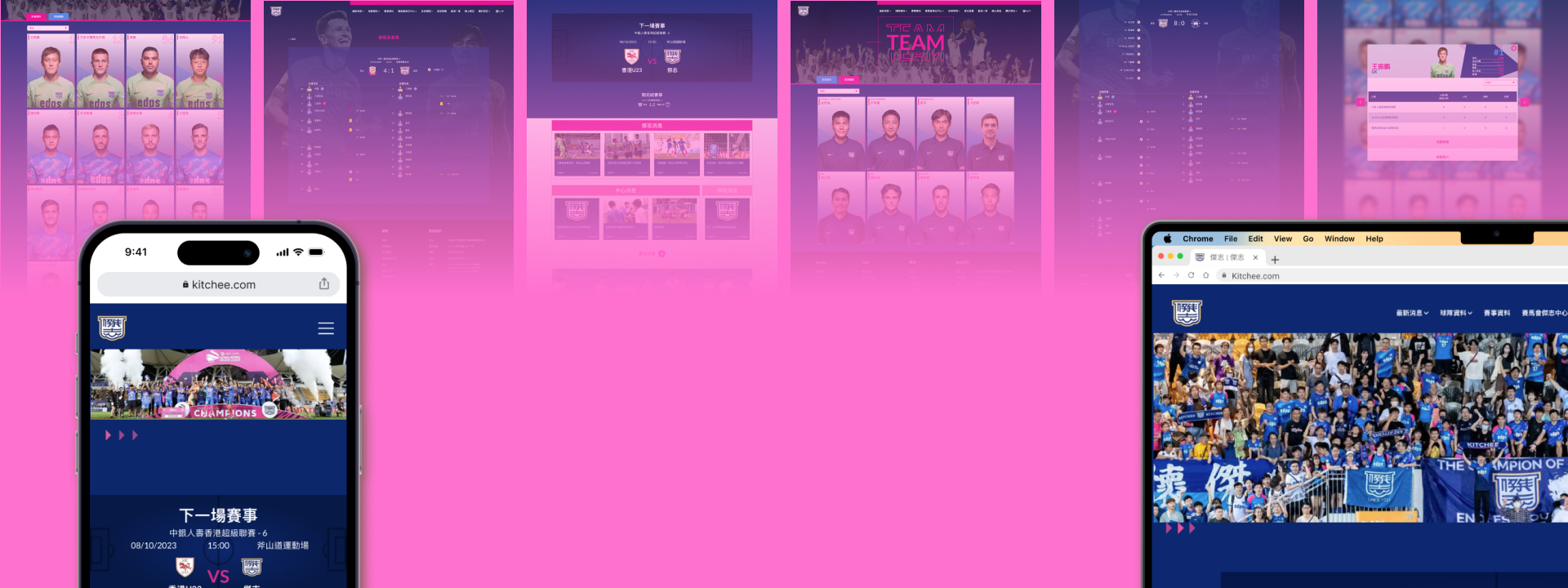
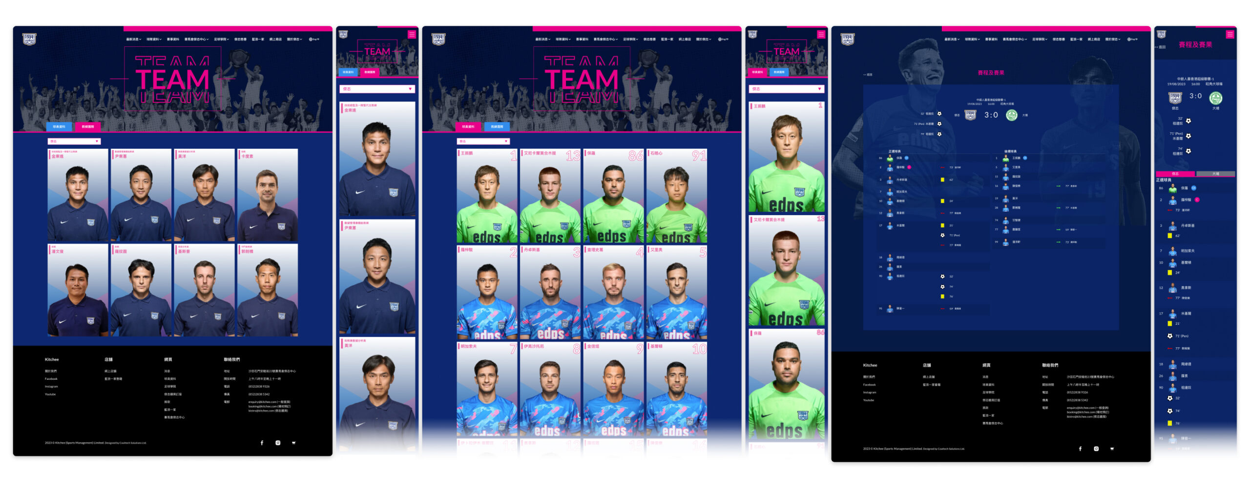
This project was to revamp the website UI design of Kitchee Sports Club to enhance the user experience and improve the overall aesthetic appeal. The team pages, match information page, and the homepage were redesigned as the client found that the original designs were not satisfied.
The Pain Points and The Solution –
Pain Points
The original design had some pain points that needed to be addressed:
The Solutions
To address the pain points and improve the user experience, the following solutions were implemented:
Requirements / System Overview –
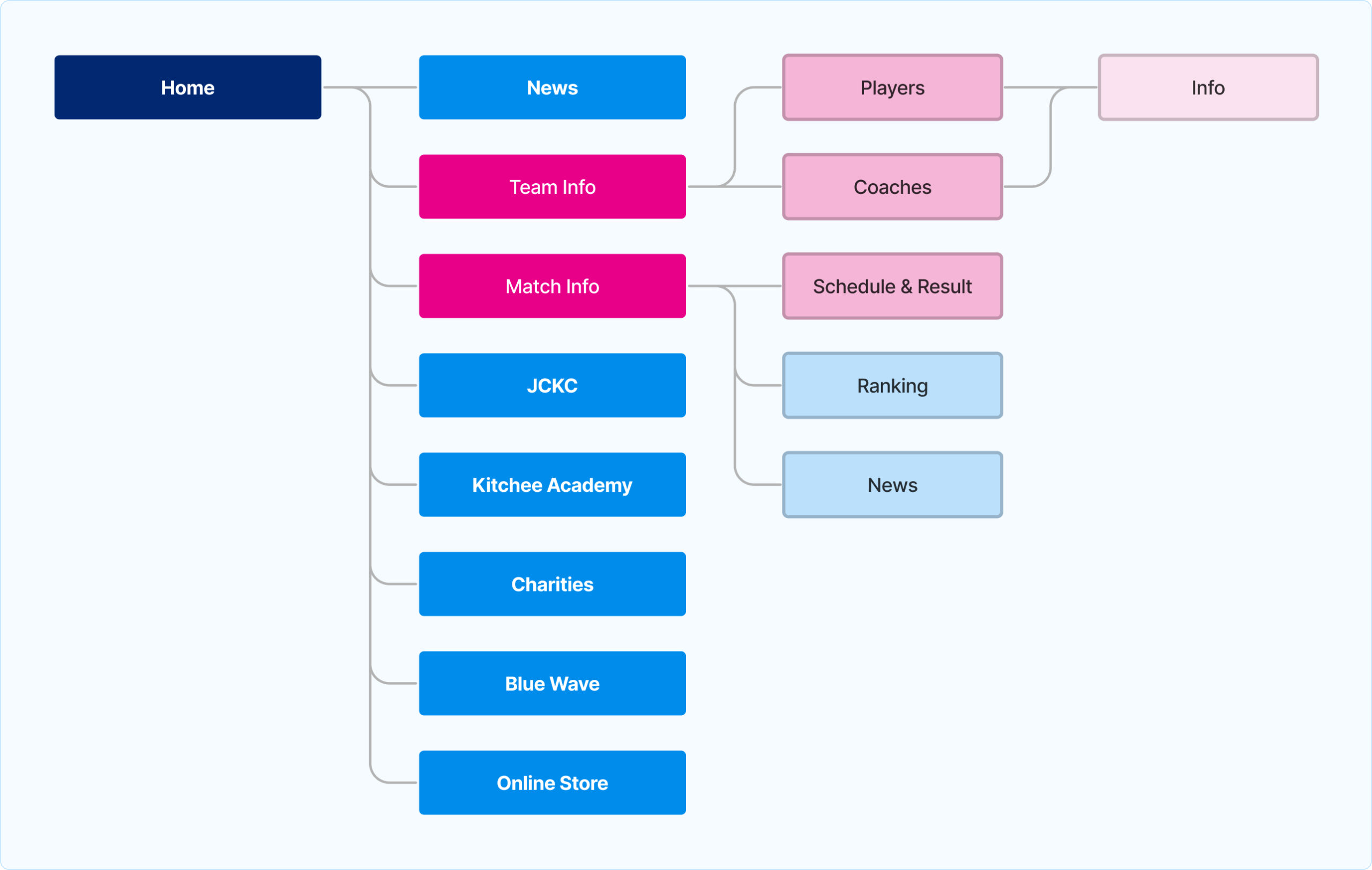
User Flow
The section with the revamped UI design is highlighted in pink in the user flow below.
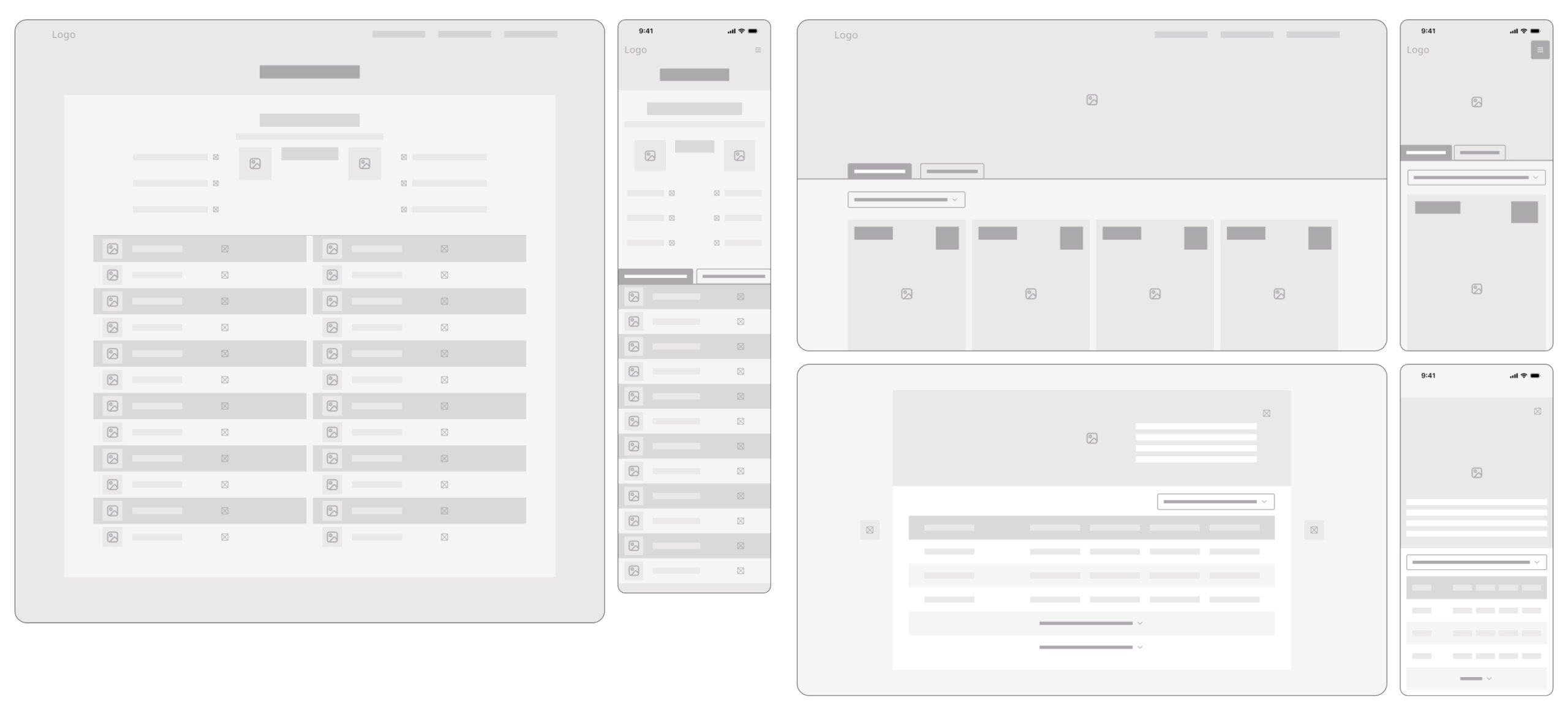
Wireframe
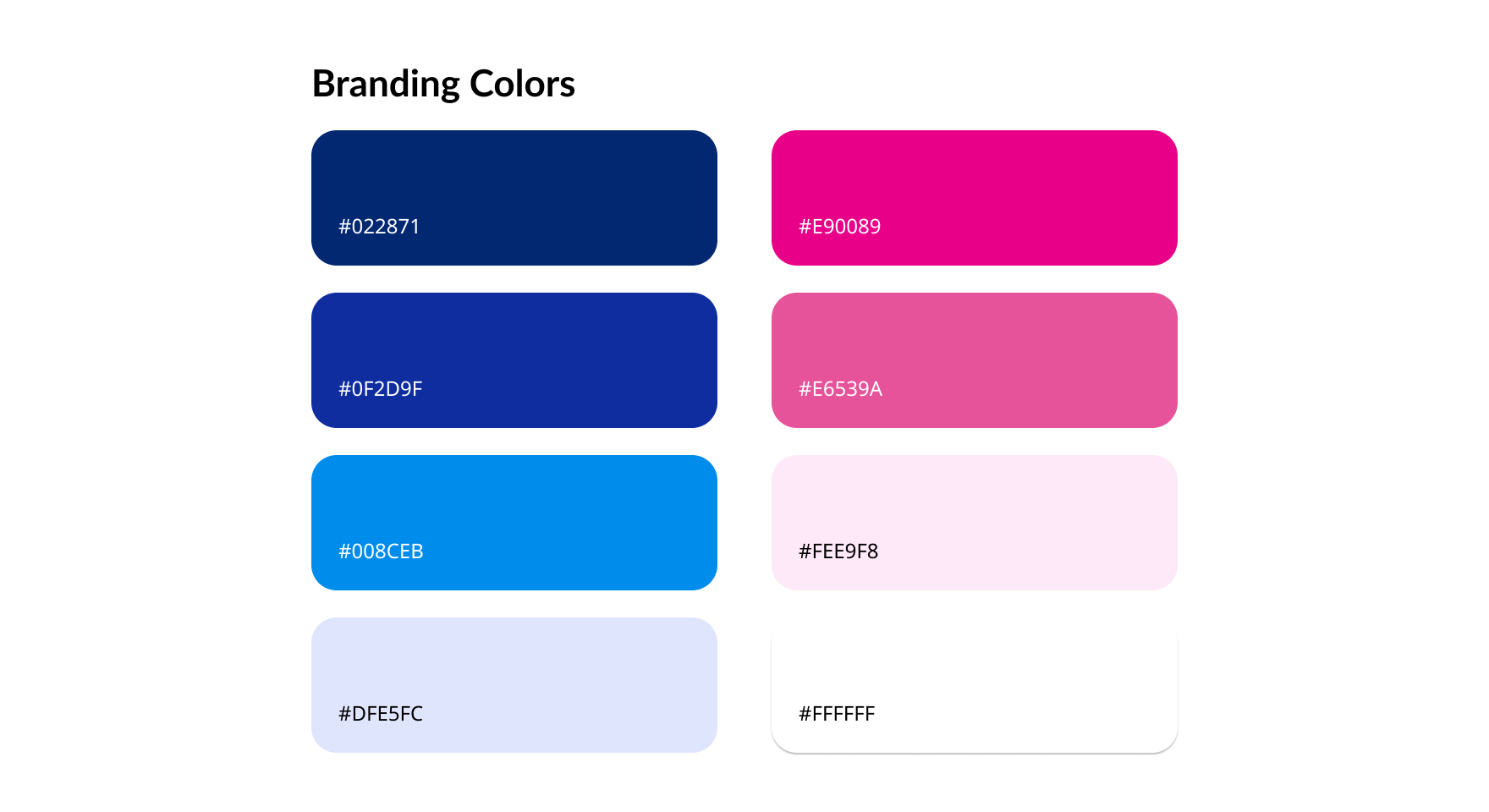
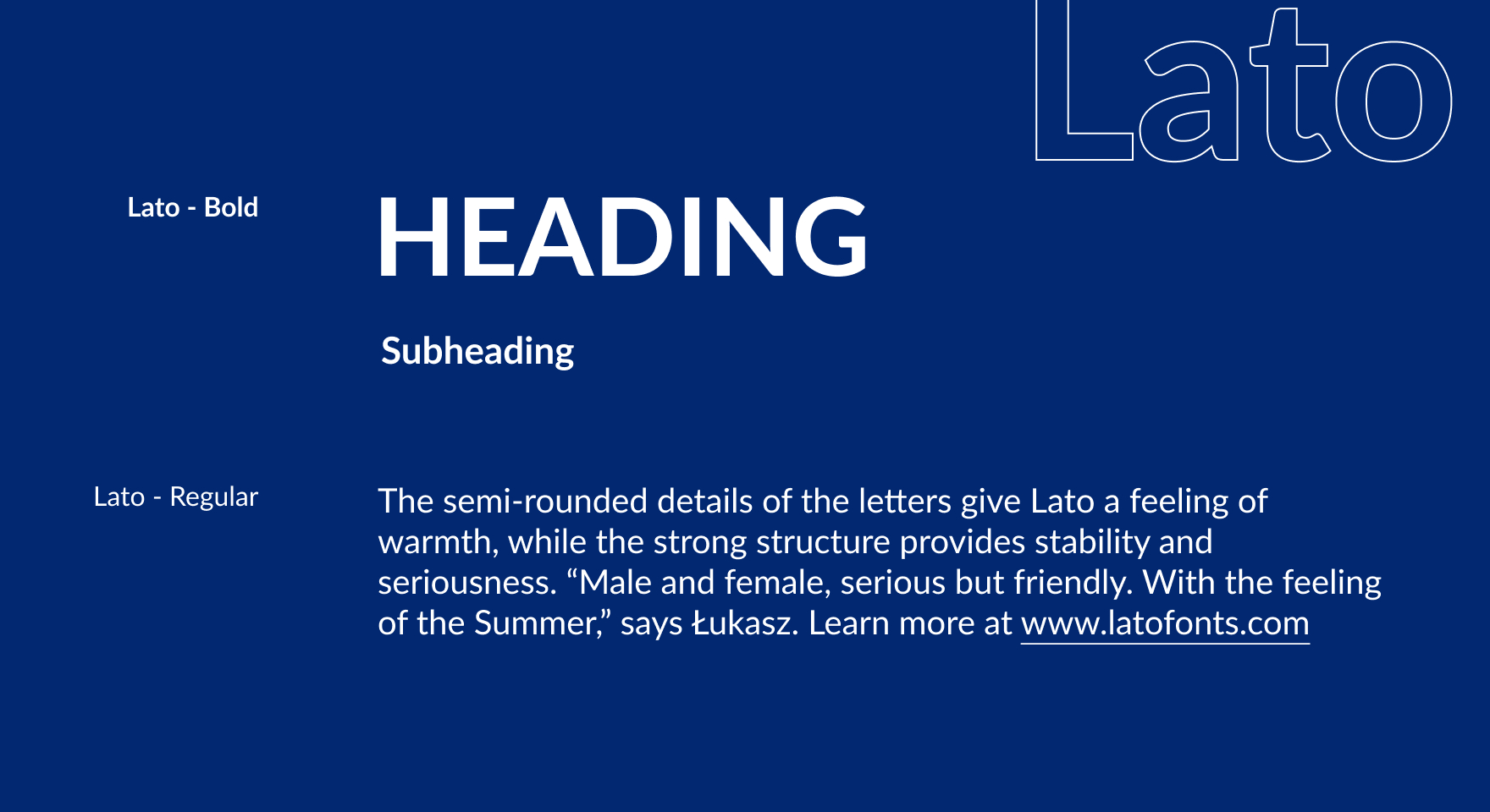
Style Guide –
UI –
1. Team Information Page
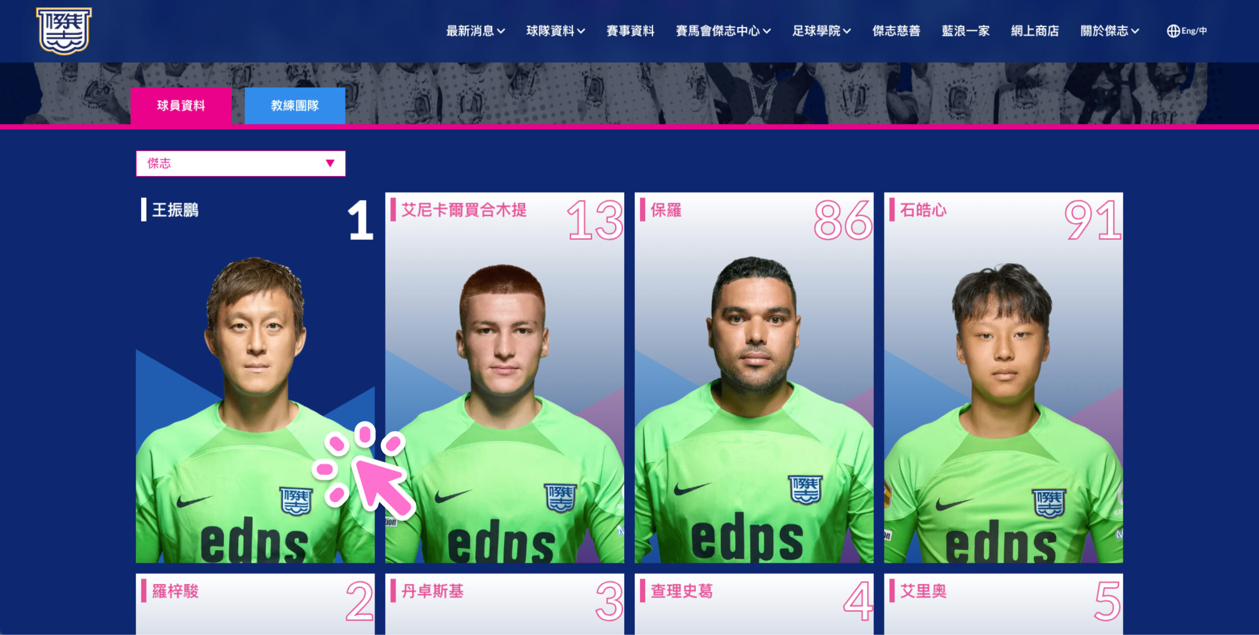
The team information page is redesigned with a grid layout displaying all footballer photos.
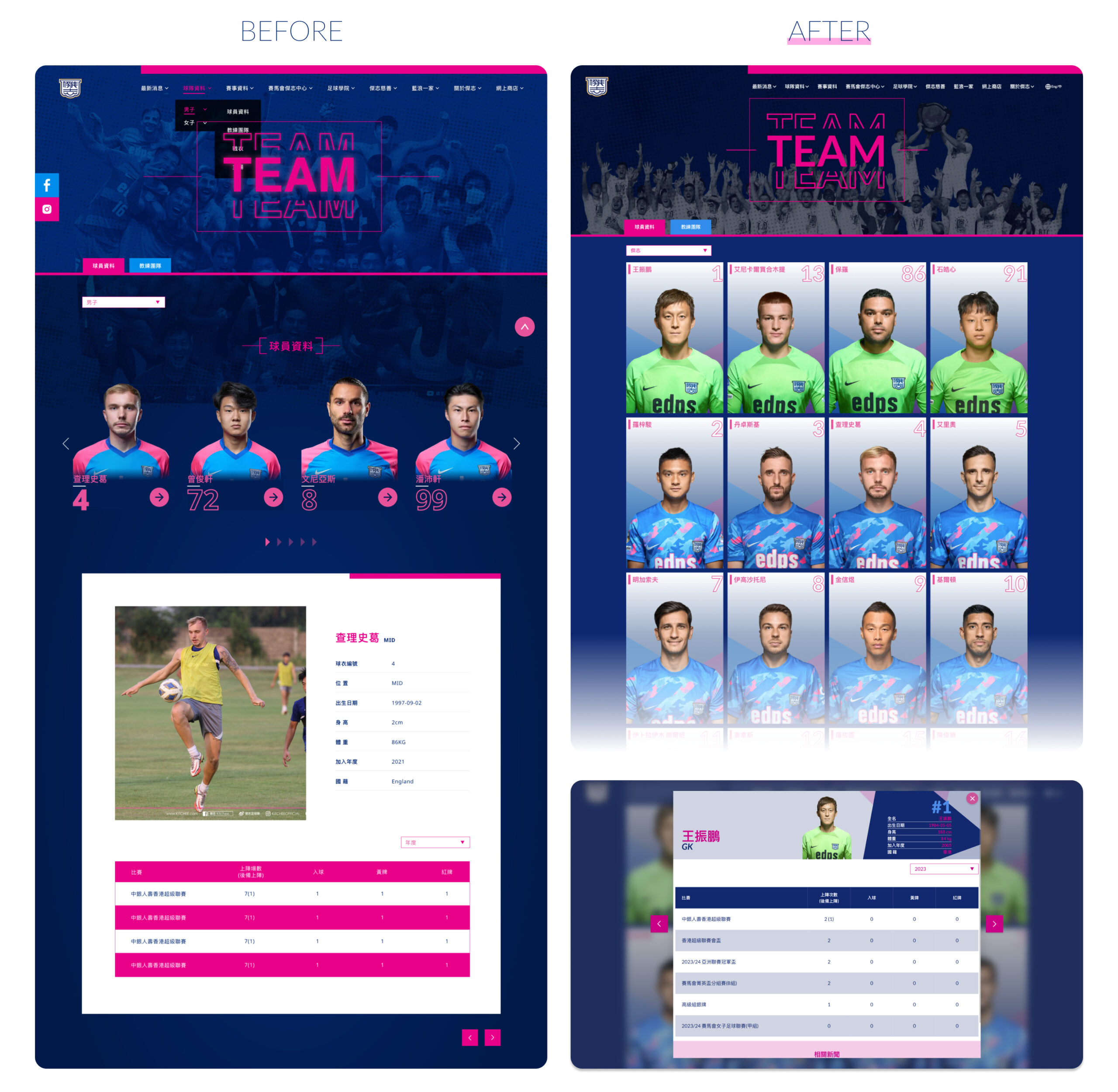
Each photo has a hover effect, providing a visually engaging experience.
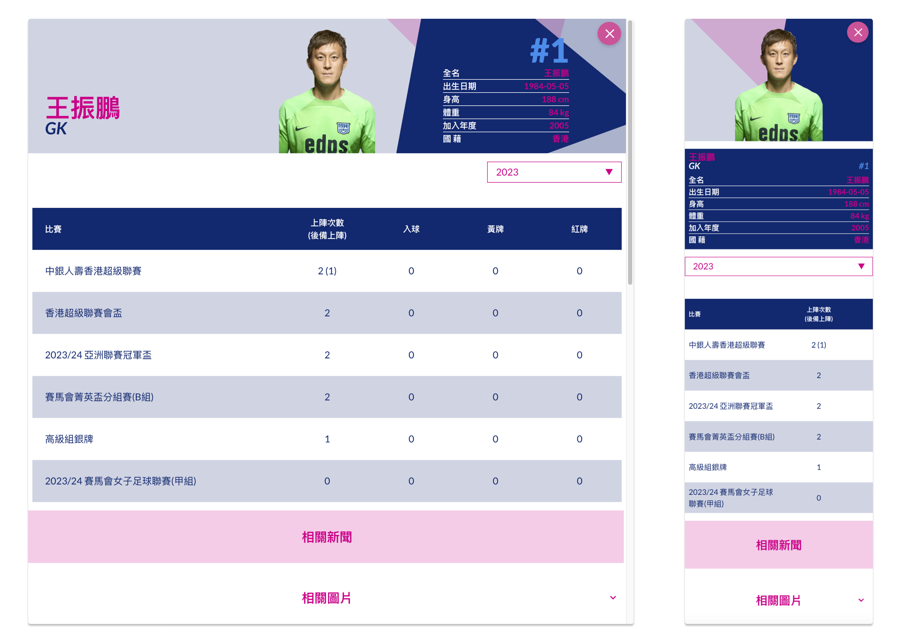
When a user clicks on a photo, a modal pop-up appears, displaying detailed information about the selected footballer.
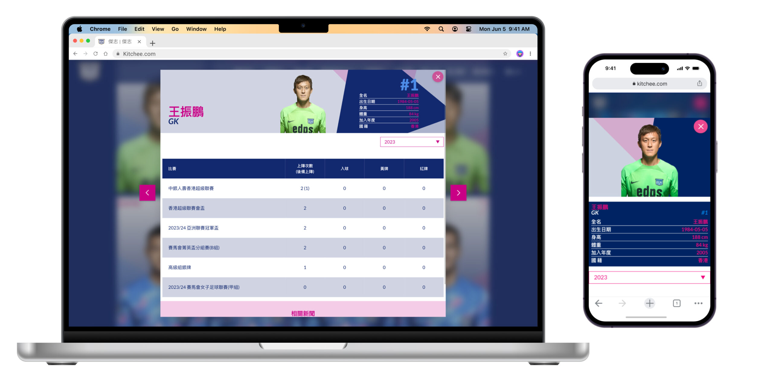
The following is the complete footballer information displayed in the modal pop-up.
2. Match Information Page
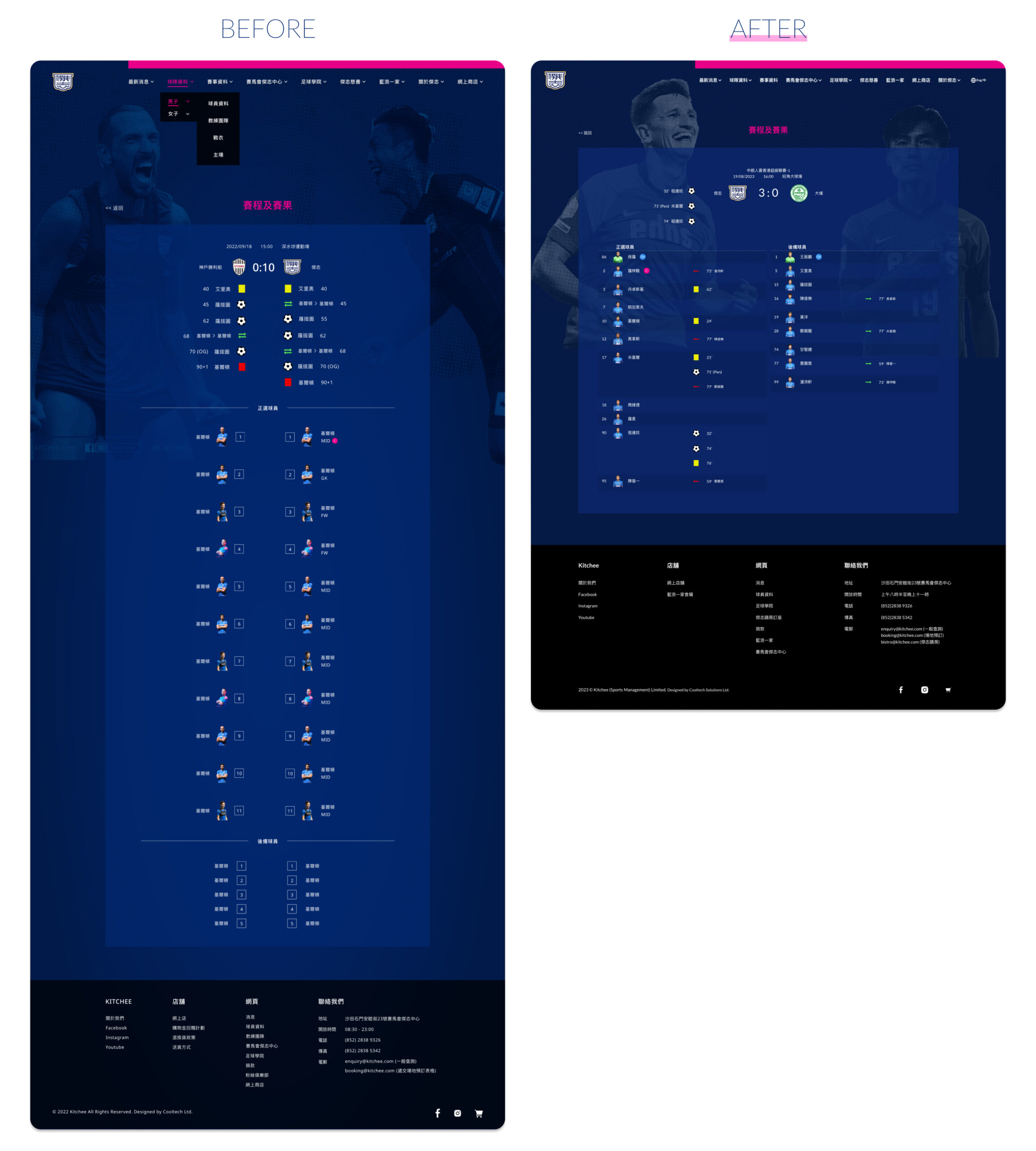
The match information page now focuses on displaying scores initially, with the footballer details placed alongside relevant information. This restructured layout ensures a more balanced presentation and allows users to easily access both match scores and footballer information.
Reflection –
The revamped UI design successfully addresses the pain points and enhances the user experience of the Kitchee Sports Club’s website. The implementation of a grid layout, modal pop-ups, and a balanced match information page provides users with a visually appealing, intuitive, and engaging interface.
However, continuous user testing and feedback collection would be beneficial to identify any further improvements and refine the design based on user preferences and needs.
