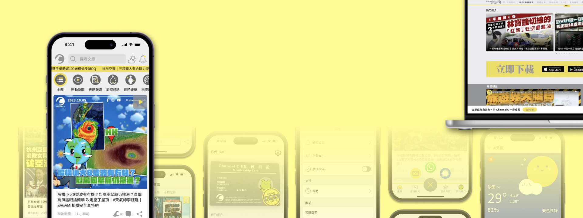
News Media
Cross-platform UI/UX Design for News Media.
Channel C HK is a newly established news media company with over 500k YouTube subscribers.
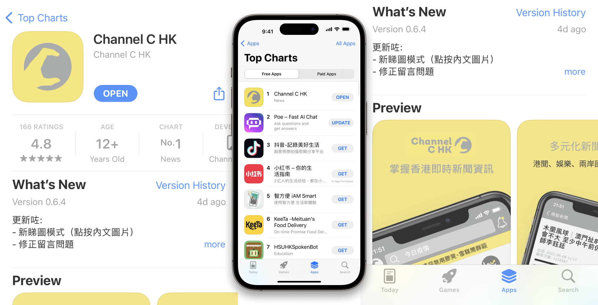
In June 2023, the mobile app Channel C HK achieved the top rank in the App Store’s chart for free apps.
The following will mainly focus on introducing the UX/UI design of the newly developed mobile app. As for the revamp of the website, it will be briefly introduced later on.
The Pain Points and The Solution –
Channel C HK faced the following pain points
A lot of channel subscribers said ”You can use social media platforms to post news and generate revenue. Why do you need to develop a app with large investment?”
In face, before the app released, they were only posting news on social media and website. I had discussed with clients and concluded that they were facing the following pain points:
Regarding posting on social media:
They have a self-owened website, but it:
In order to expand the business and looking for more opportunies, so they need a dedicated platform and they found that developing a mobile application would improve the situtation.
Goal –
In June 2023, the mobile app Channel C HK achieved the top rank in the App Store’s chart for free apps.
The following will mainly focus on introducing the UX/UI design of the newly developed mobile app. As for the revamp of the website, it will be briefly introduced later on.
Requirements –
To achieve these goals, I have discussed the following features with the client that the app should be included in in the first stage:
Easy navigation with categorisation: Users should be able to navigate through the app seamlessly and find the desired news content to find and consume relevant information with intuitive navigation.
Engaging multimedia: The app should offer a visually appealing and interactive experience by incorporating images, videos, and other multimedia elements.
Push notifications: Users should receive timely notifications for breaking news and updates based on their selected categories.
Social sharing: Users should be able to comments and share.
Call to action for Subscription.
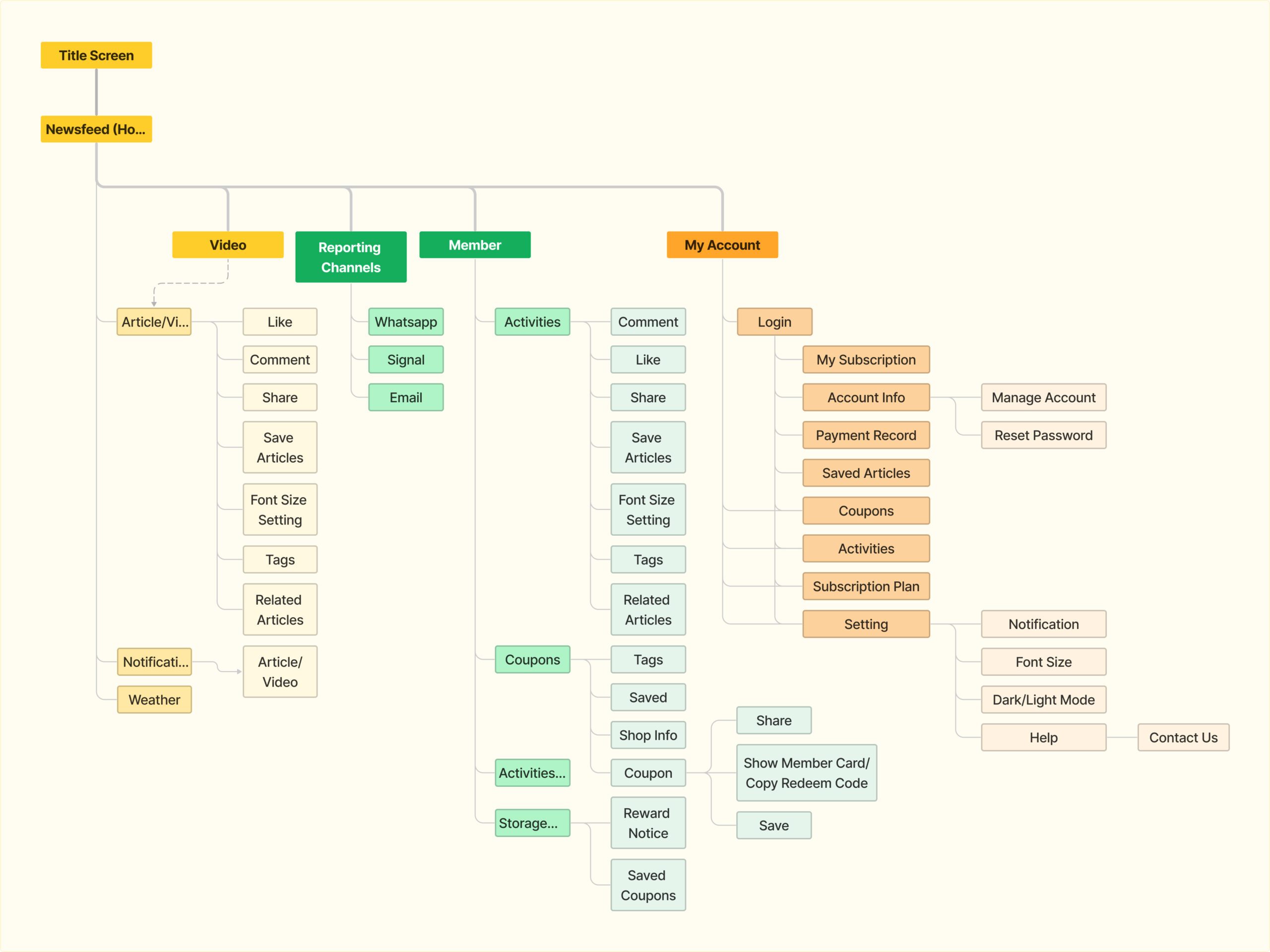
System Overview –
User Flow
The user flows were then created to demonstrate the important functions featuring the requirements mentioned before on this stage.
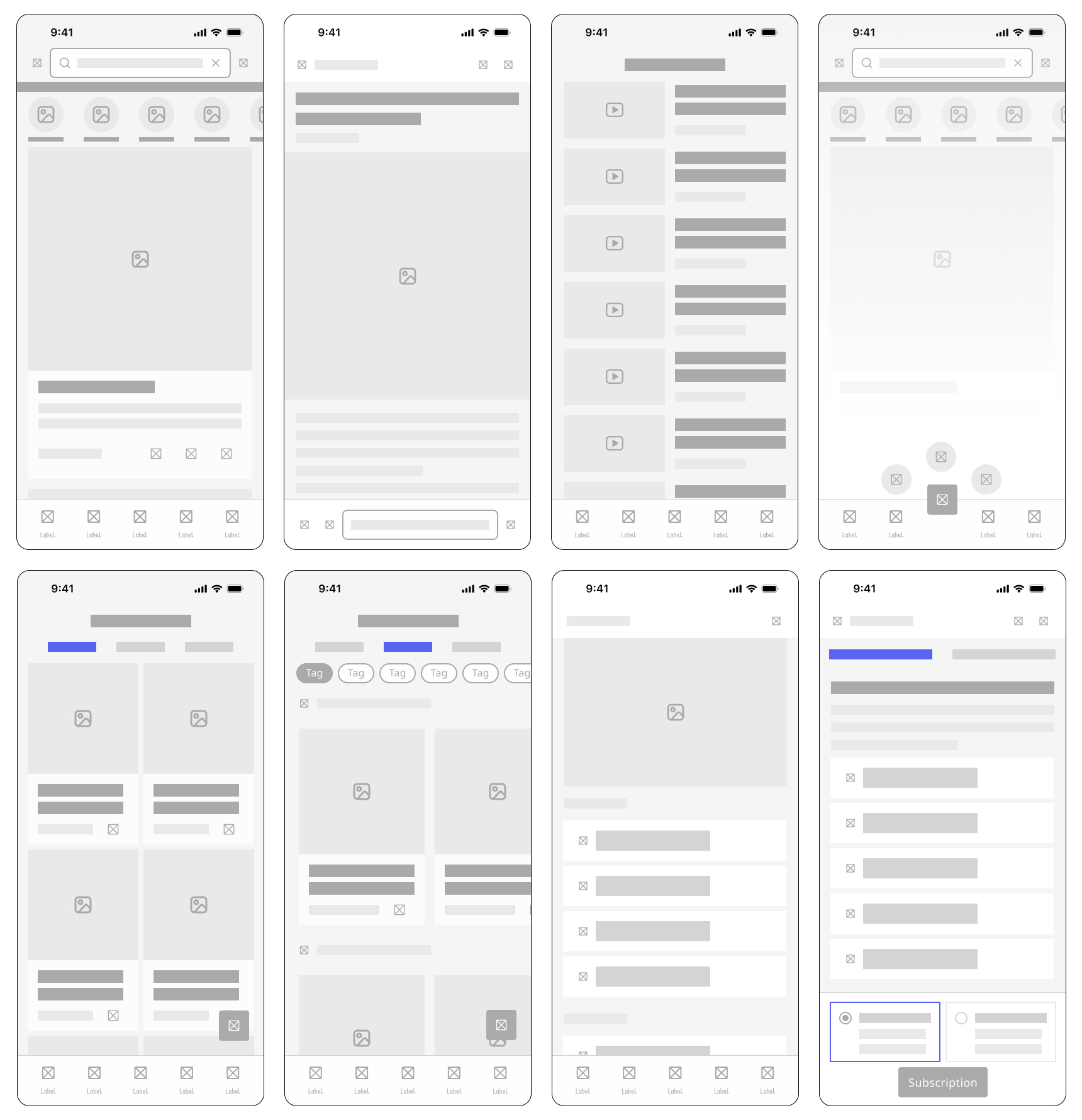
Wireframe
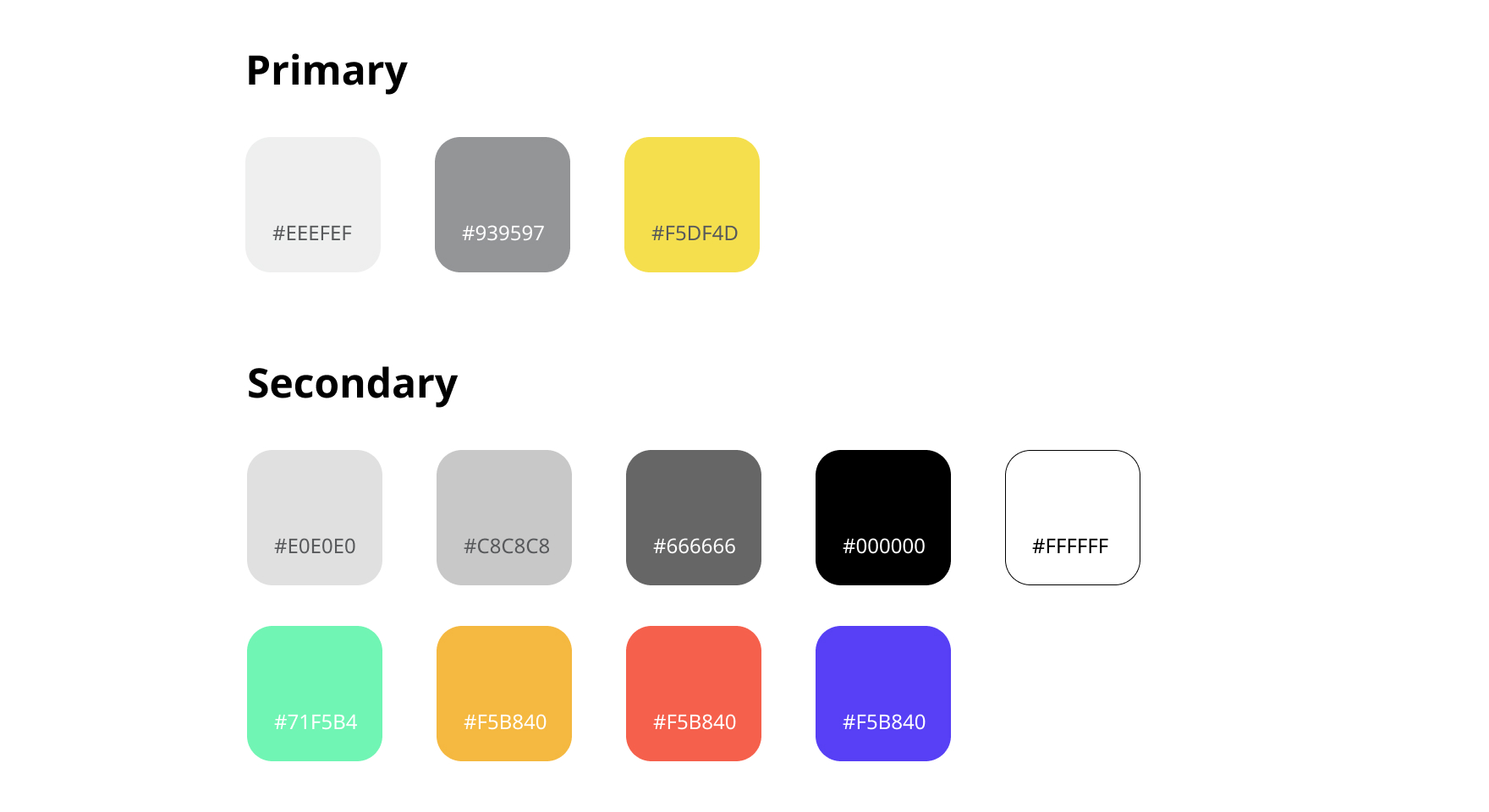
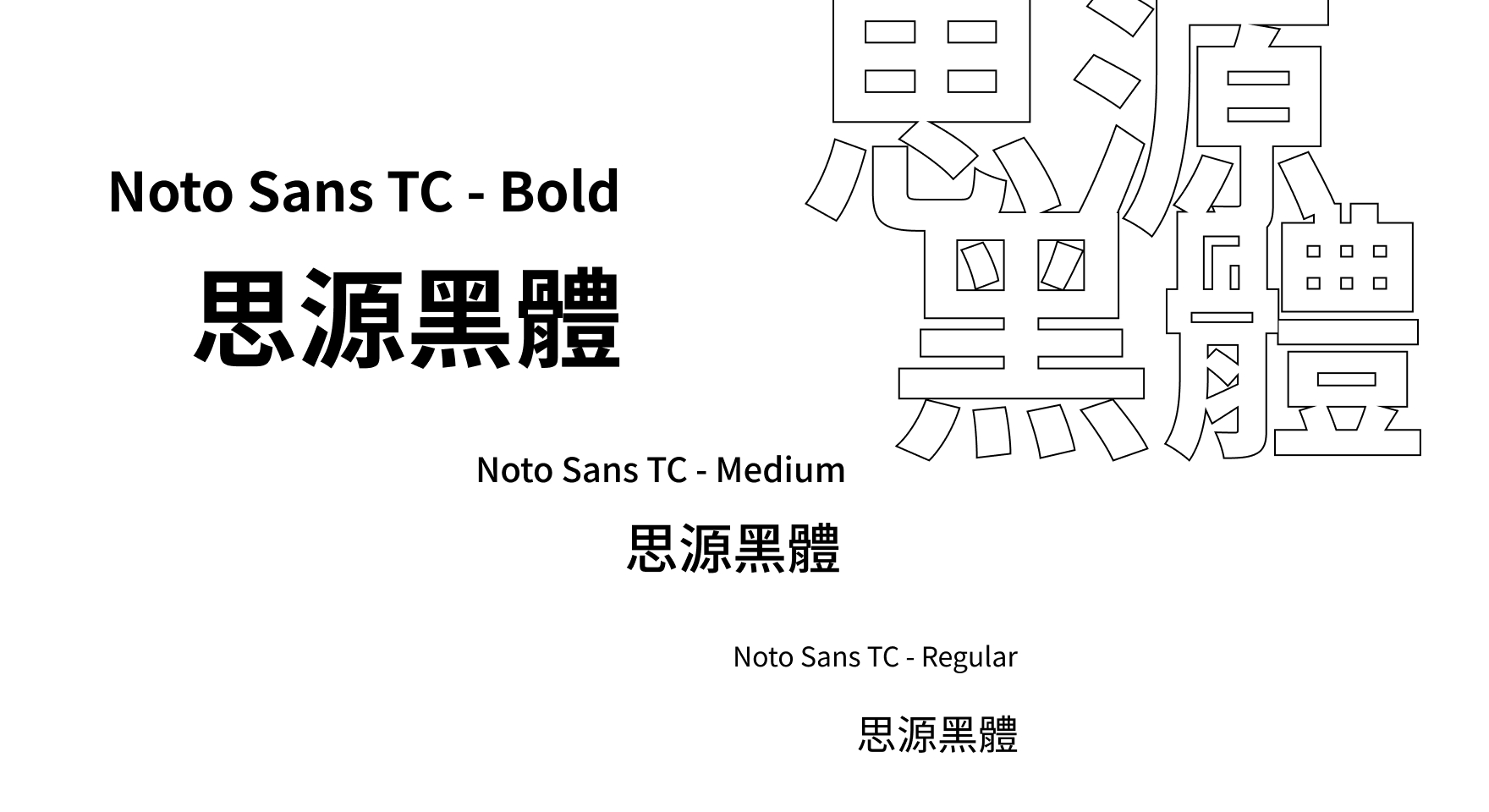
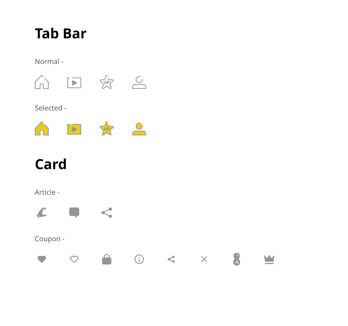
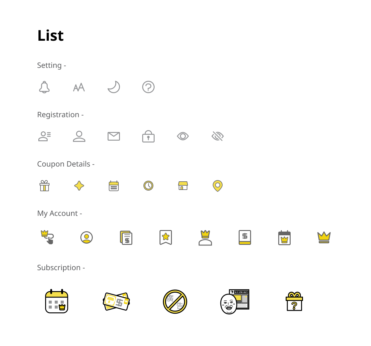
Style Guide –
Illustrations –
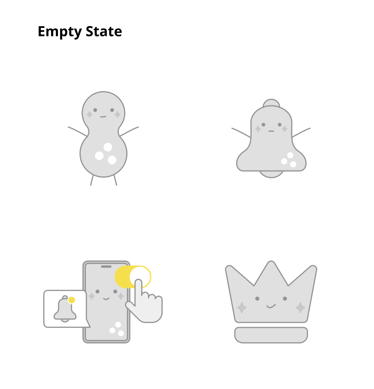
Animations –
Title Screen
Loading
Article “Like”
Storage Box Idle State
Storage box “Saved” Action
Mobile App UI –
1. News: Homepage News Categories and Video
An intuitive interface with news categories displayed prominently, allowing users to select their desired topics easily with swipe on the screen. Users also able to comment, like and share the news articles within the app.
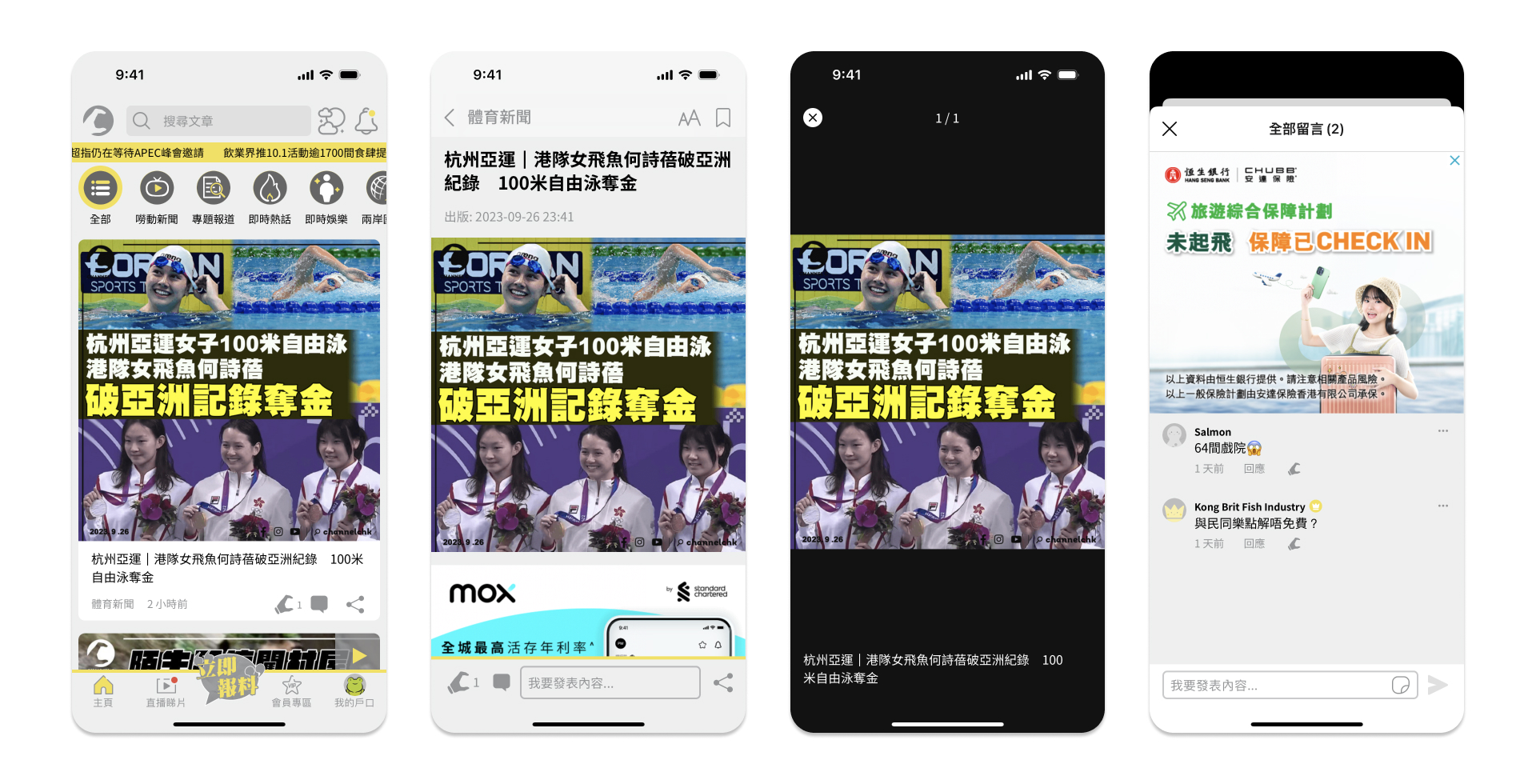
A visually engaging layout, featuring thumbnail previews of the latest video news content, and allowing users to play videos directly within the app.
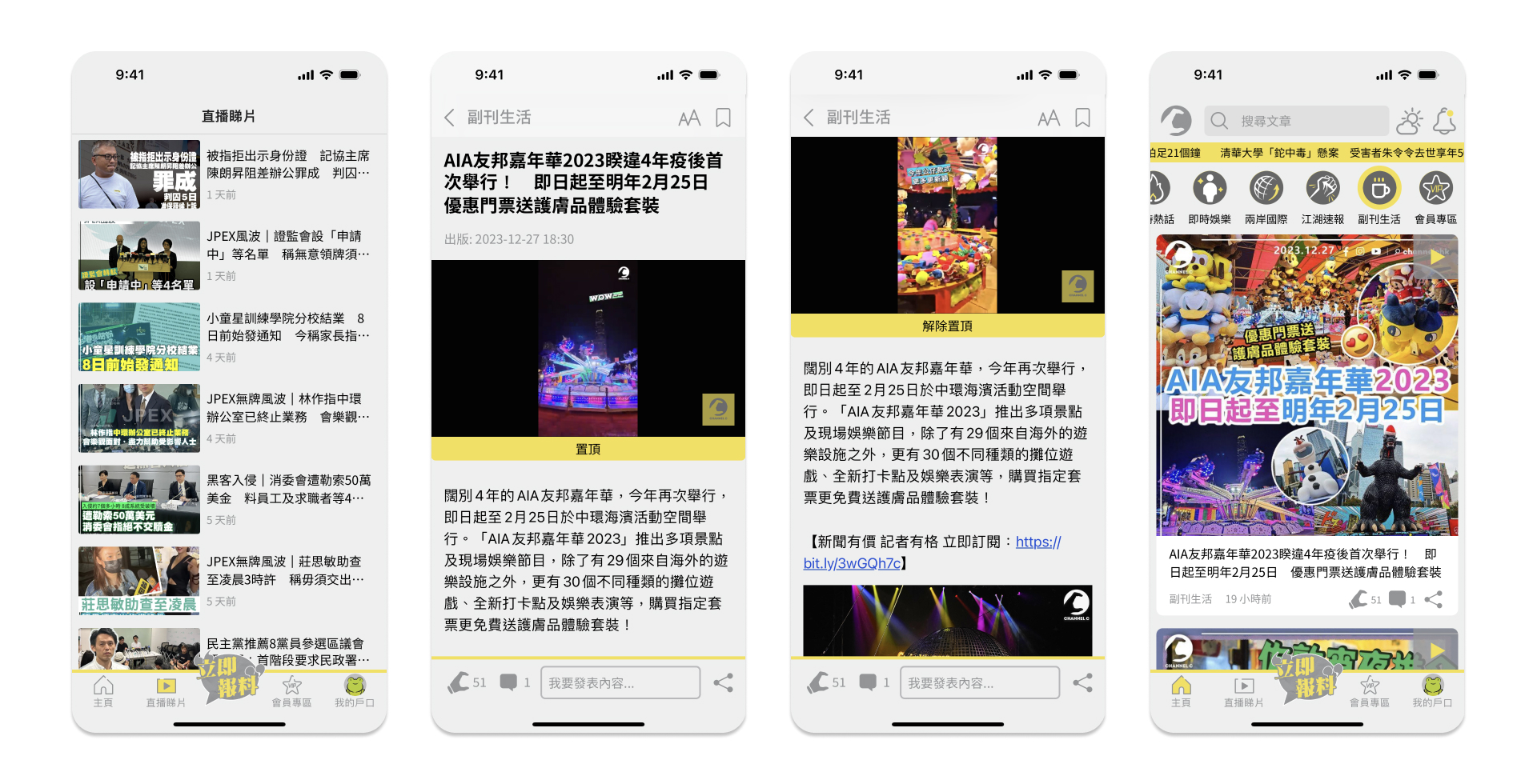
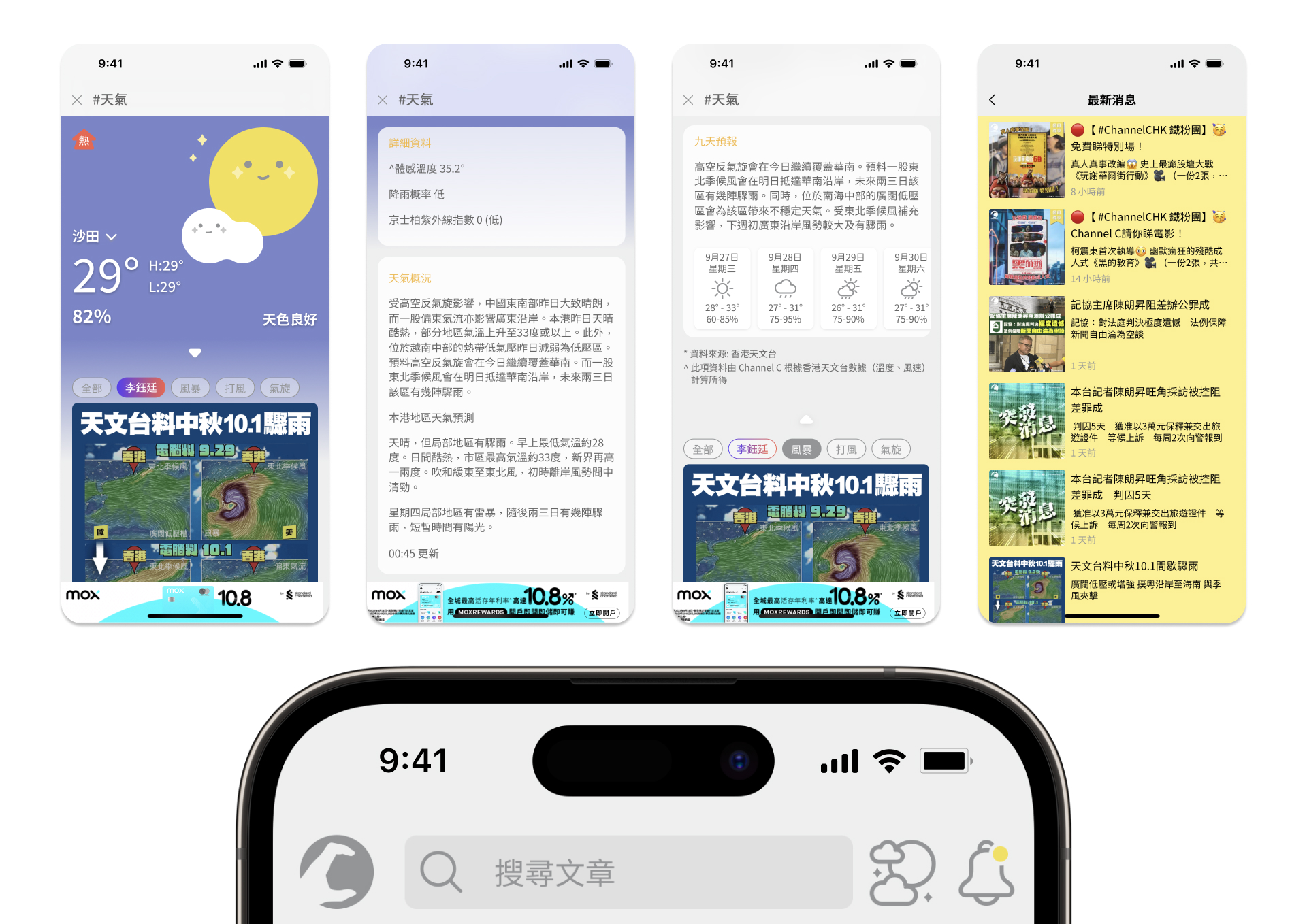
2. Weather and Notification
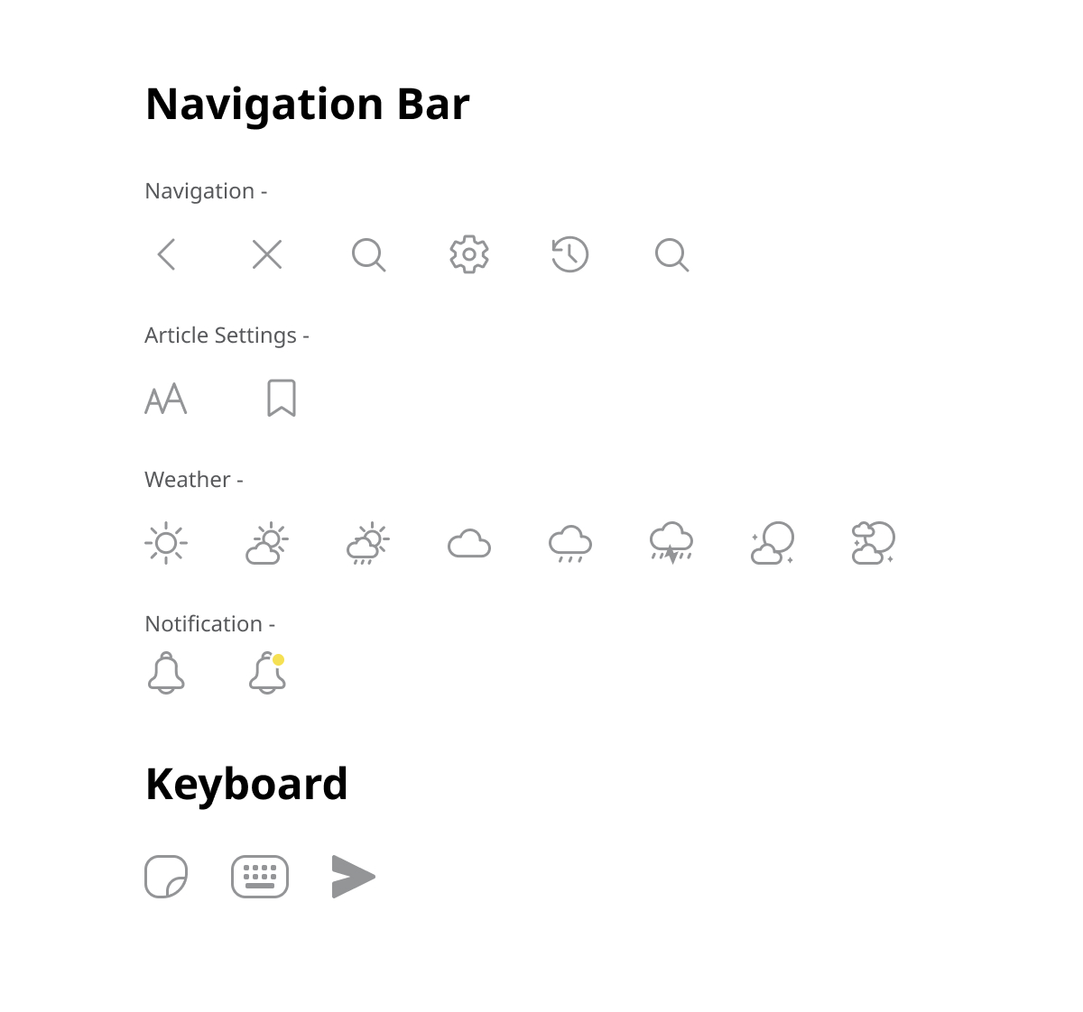
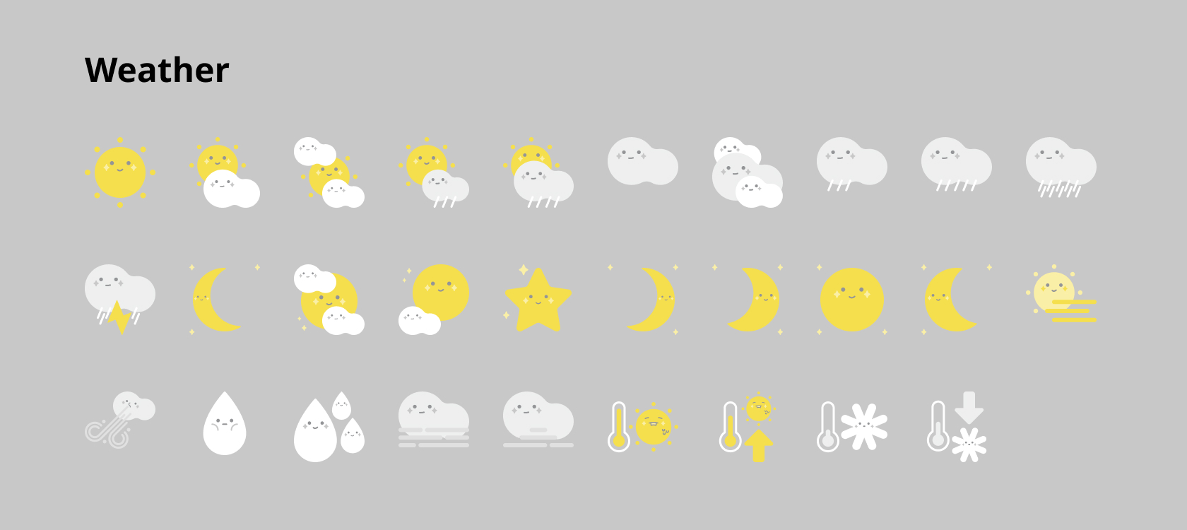
Regarding the analysis of readers’ preferences of the client, weather is hot topic. Therefore, providing weather information and the related news by placing a weather icon in an intuitive area — the corner of navigation bar for easy access, would definitely enhance the user experience.
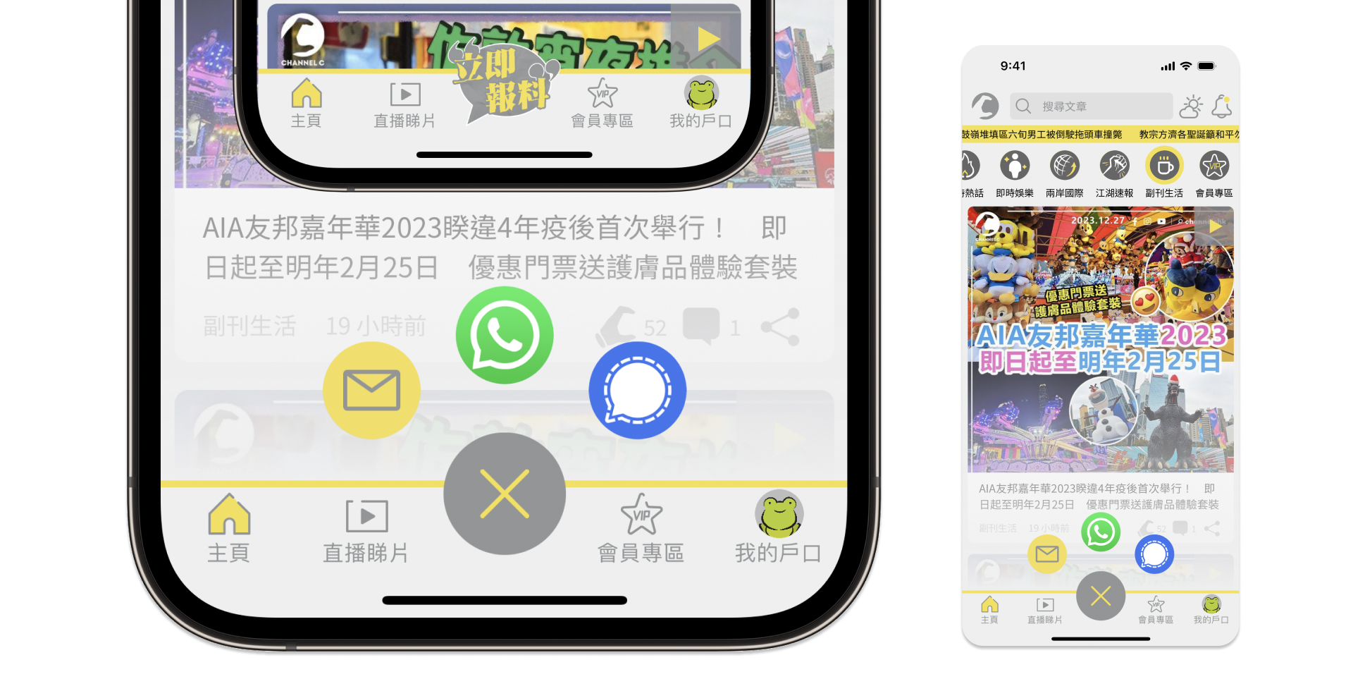
3. Report News Channels
In order to catch the latest and exclusive news sources, an easily approachable reporting flow is provided when they encounter any first hand news source.
4. Subscribers Benefits
Subscribers to Channel C HK would enjoy exclusive benefits within the app and website, such as exclusive discount offers provided from business partners and subscribers only activities.
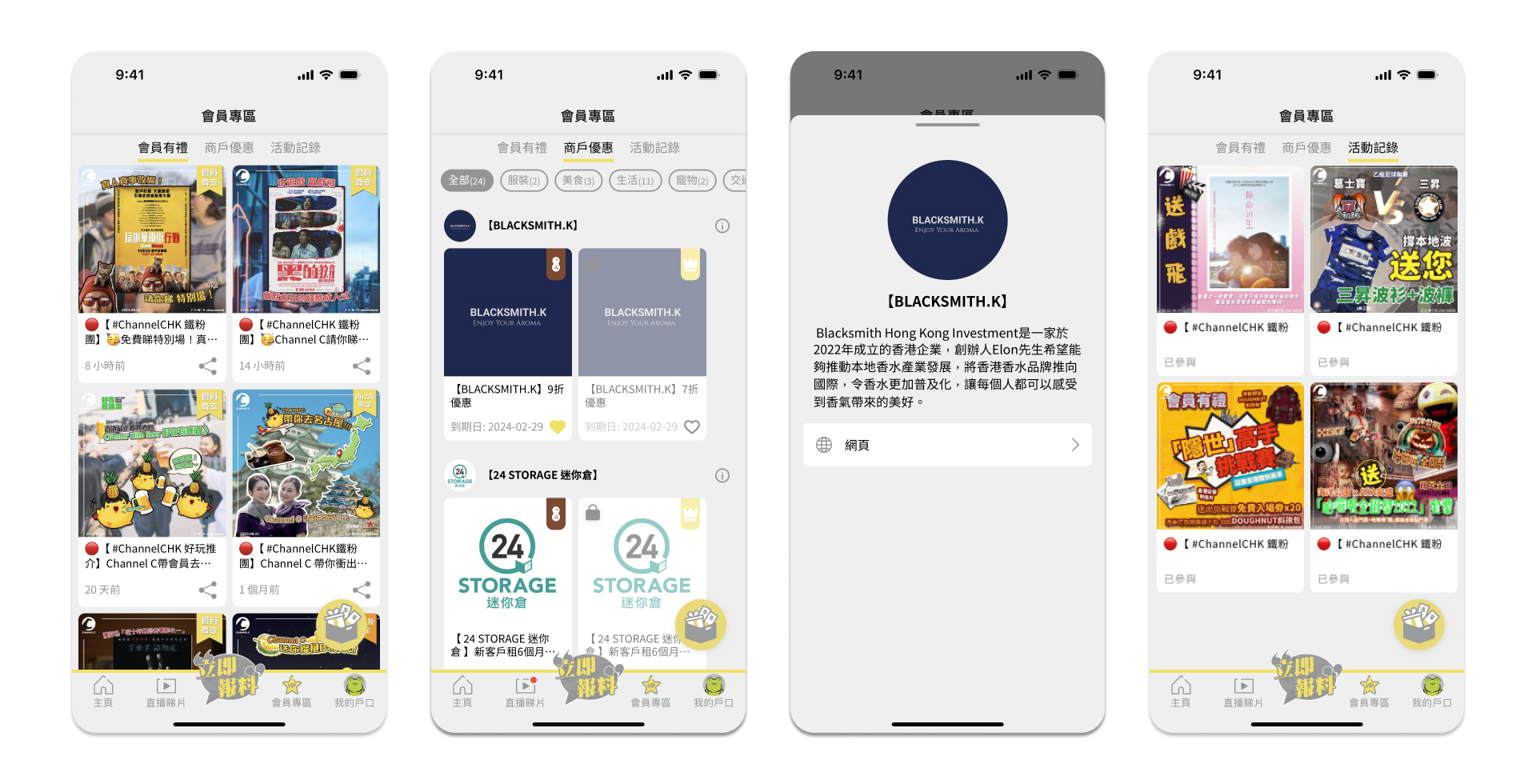
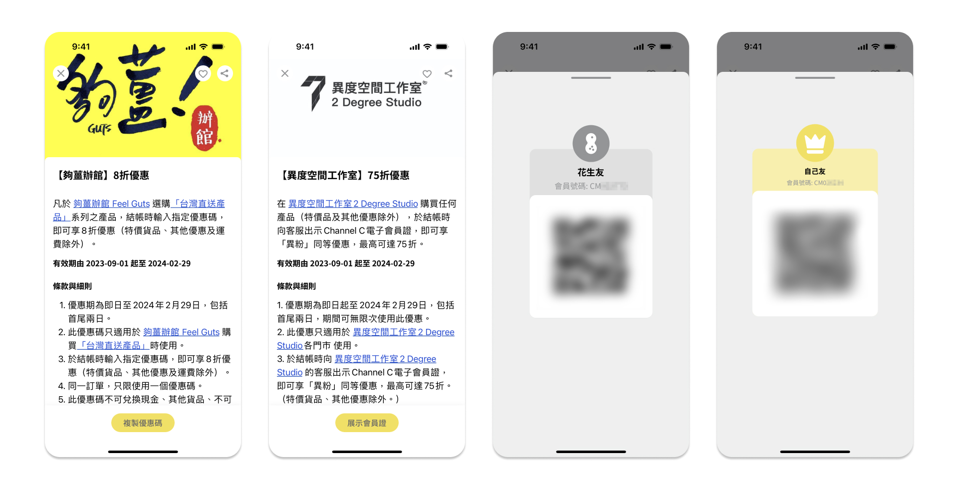
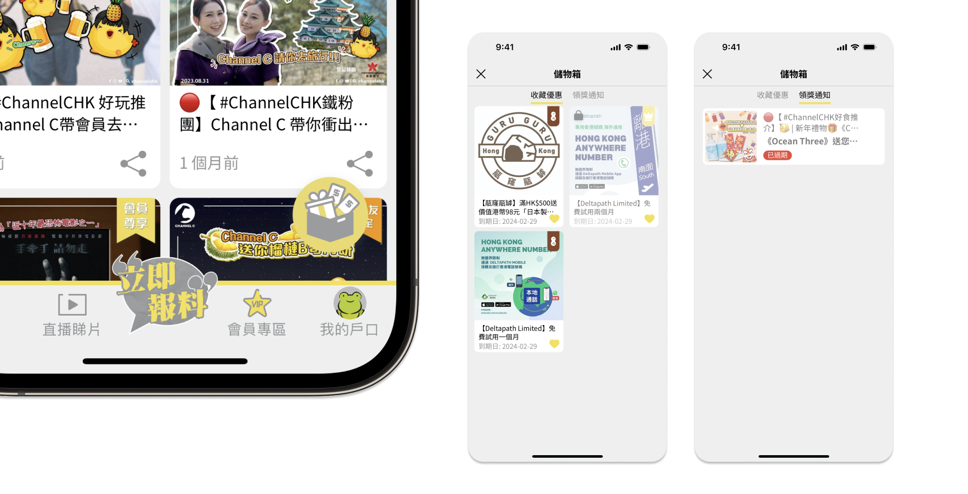
Personalised storage box for keeping favourite benefits and activities rewards.
5. My Account
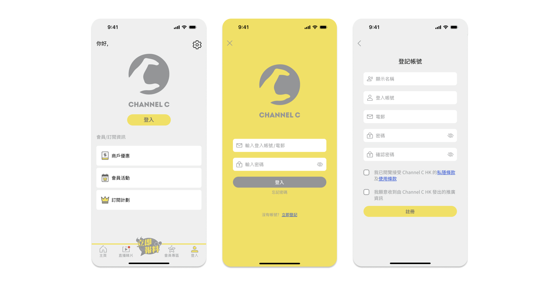
Due to belief of client, users are fully accessible to news articles and video without login. In order to attract the member registration of user, the exclusive benefit offered to members are putting in the login tab to attract signing up.
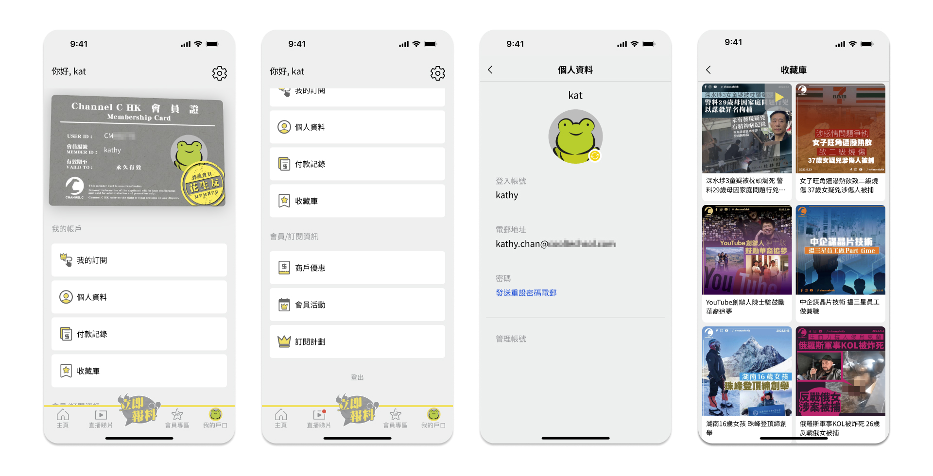
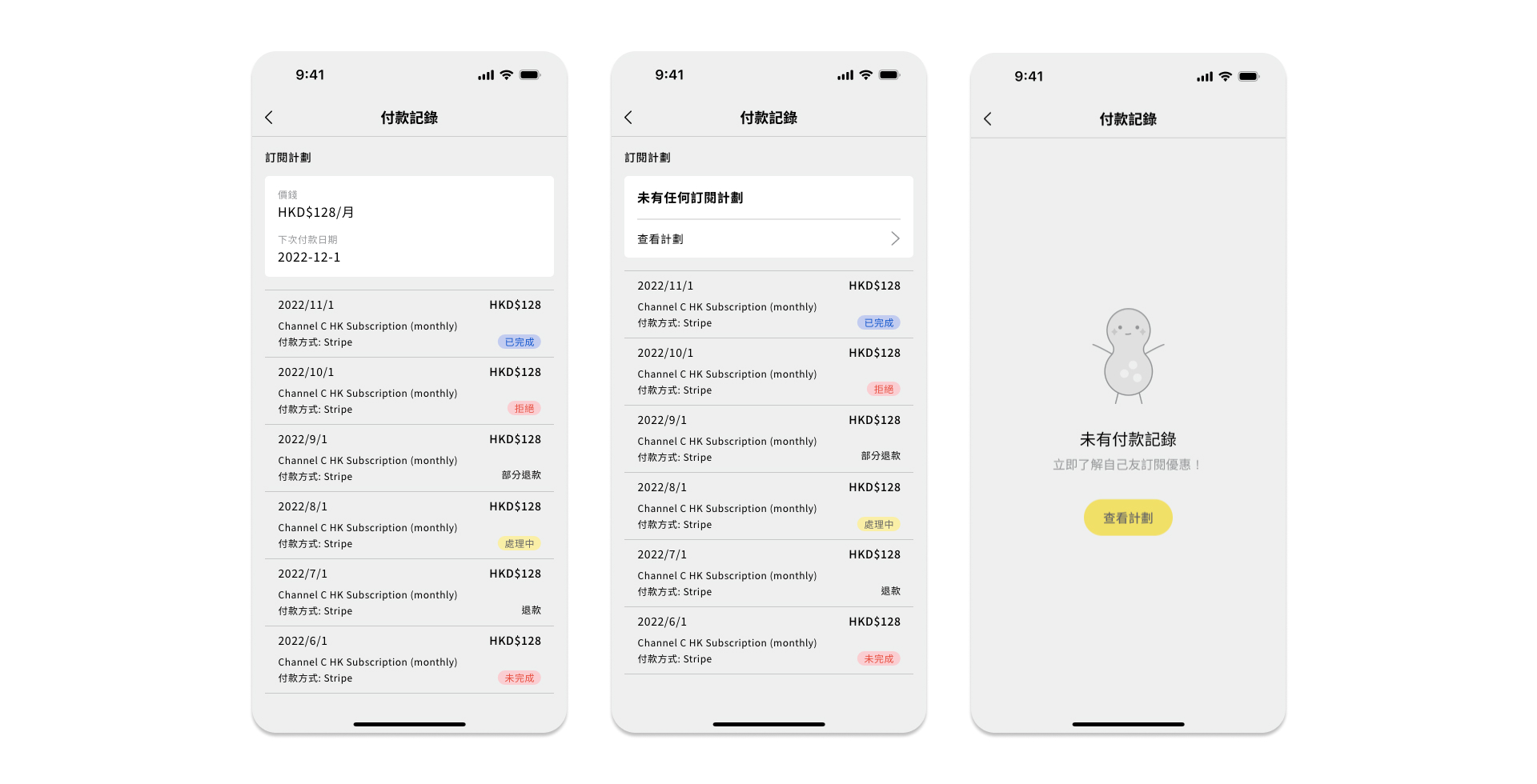
After logging in, the My Account page would enable users to view their profile settings, manage subscription, and access features like saved articles and videos.
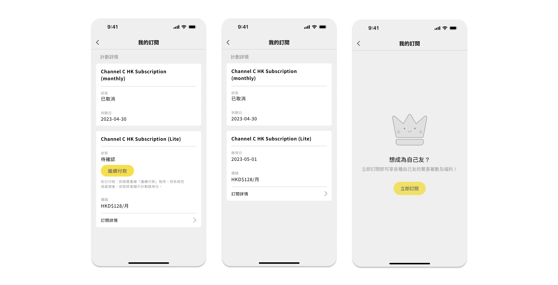
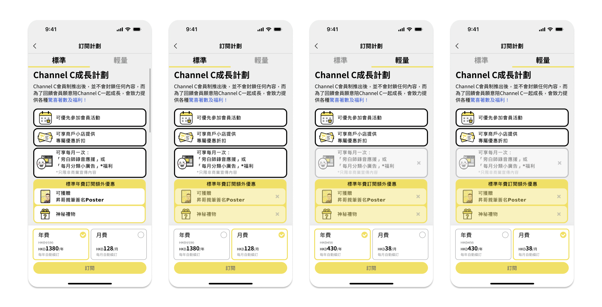
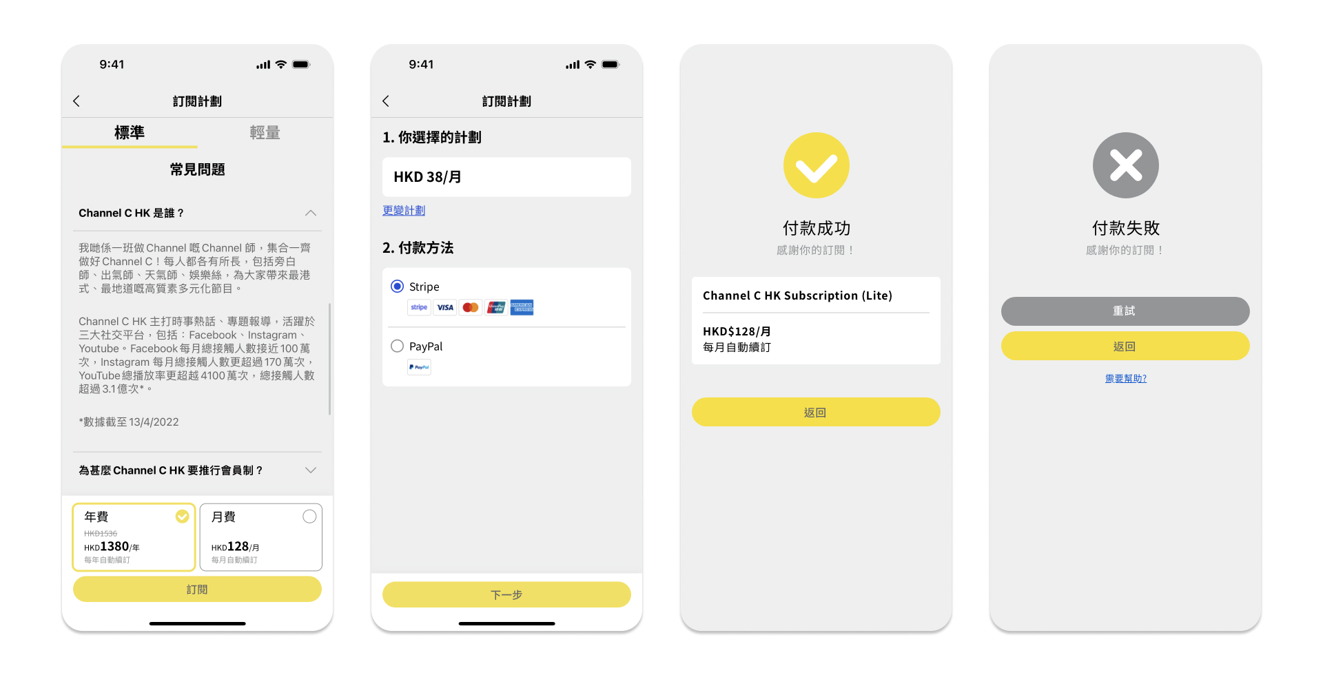
6. My Account > Subscription
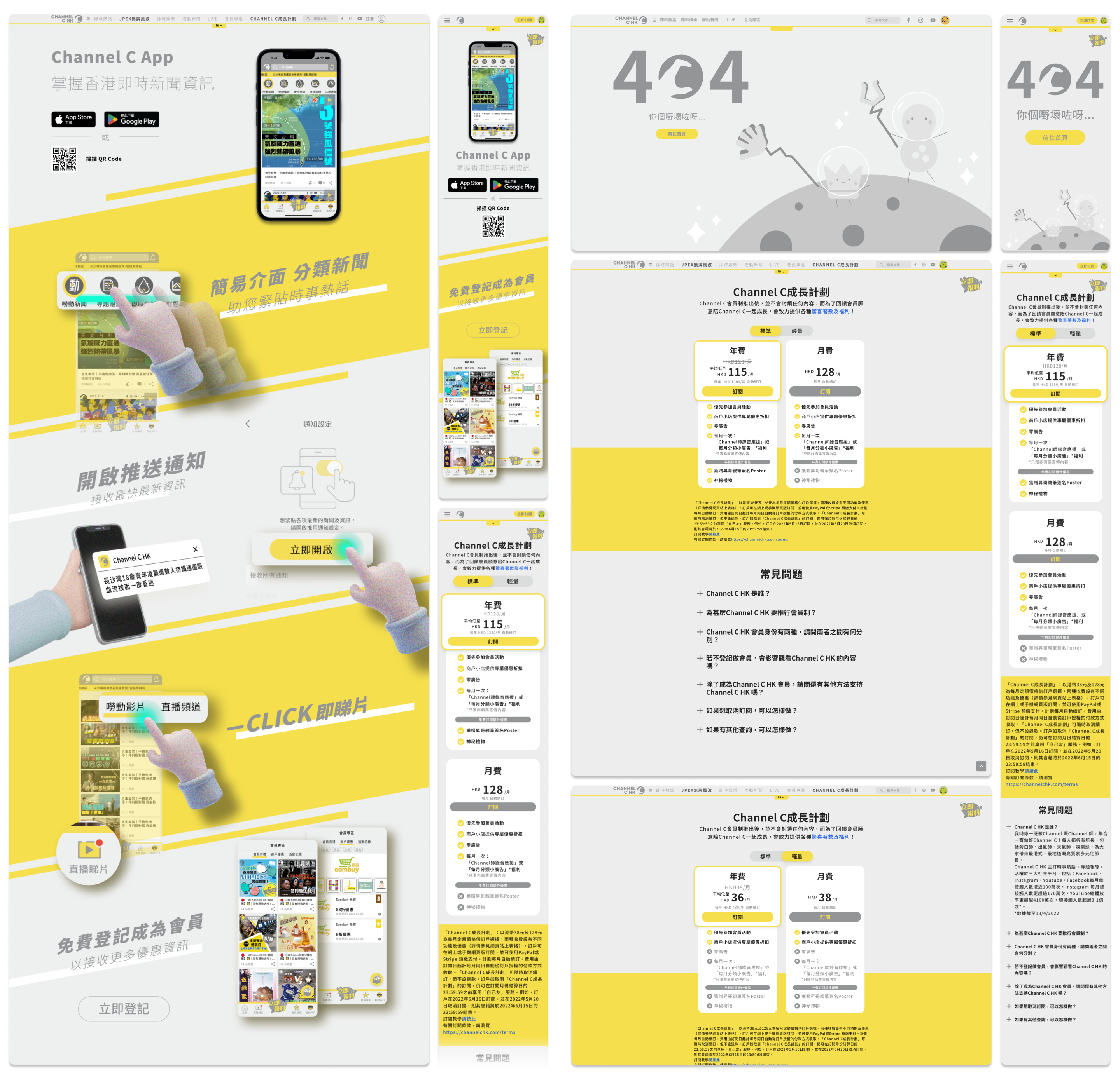
Not only is the price different, but the benefits offered for monthly and annual payments also vary. Therefore, the list of benefits will change when choosing to pay monthly or annually.
Web UI : Before and After –
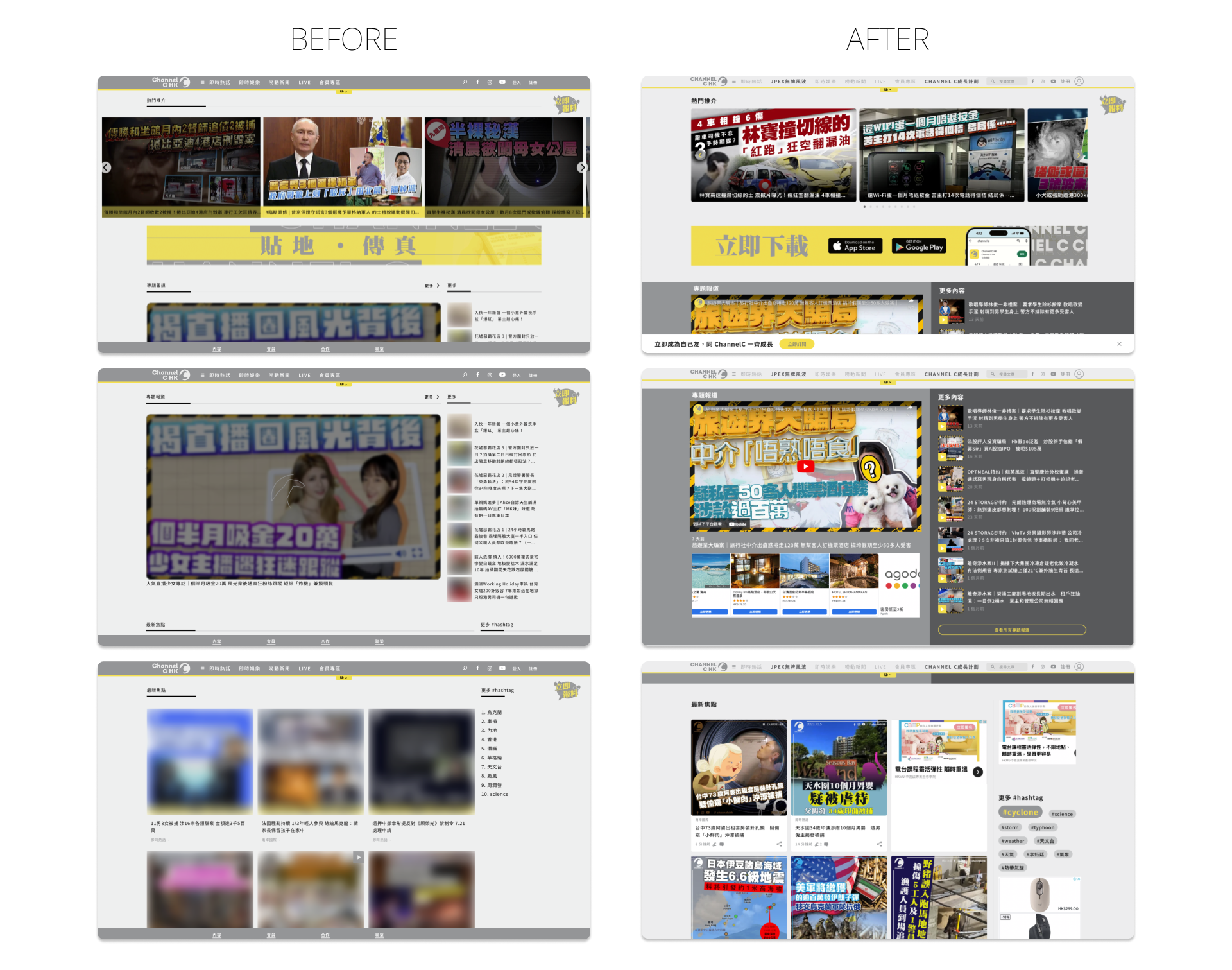
[Homepage]
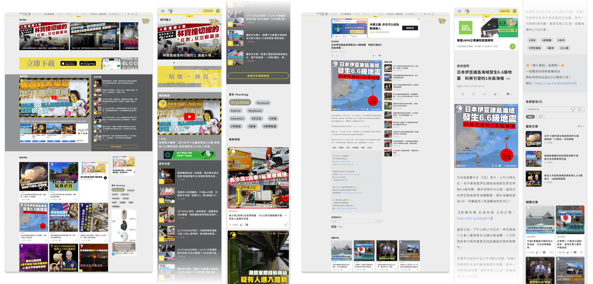
As a news media platform, the homepage should appear informative yet tidy. Therefore, I have made the following adjustments:
Navigation Bar: Changed to a light grey color, matching the background, to create a brighter aesthetic.
Carousel Slideshow: Narrowed and aligned it within the page border grid to achieve a cleaner look.
Special Coverage: Since this category is highly popular among our audience and is usually presented through videos, I applied a dark grey background to highlight and separate it from other sections, while also ensuring familiarity for users.
Article Cards: Displayed the number of comments and likes without requiring users to click into each article. This allows users to satisfy their curiosity about others’ comments directly from the card itself.
Tags: Modified the UI to make them resemble actual tags, enhancing their visual appearance.
News Article and Comments
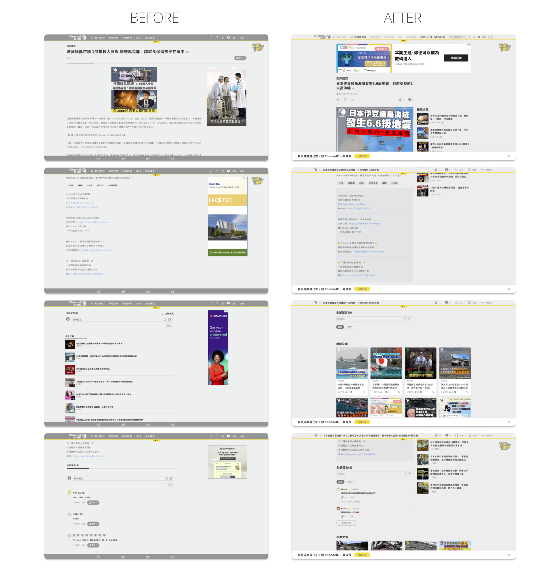
Regarding the content of news articles, the grid has been arranged to make it appear cleaner and more informative.
Monetization: Upon clicking into a news article, a large advertisement will be displayed regardless of whether the user is on desktop or mobile.
News content (Image and Text): The images have been enlarged and aligned with the text, placing them on the left-hand side to create a cleaner and more attractive layout. This adjustment also frees up space on the right-hand side.
Latest News Articles: To encourage users to read more and stay on the website, additional content is now displayed in a more intuitive manner. The latest news section has been moved up next to the news content.
Related News Articles: The inclusion of this section aims to increase reader engagement and encourage more clicks. It is now presented in the form of cards instead of rows, as this takes up less space and is more visually appealing for desktop users to access more content.
Tags: The UI has been enhanced to provide a more visually appealing and clickable appearance.
Extra Information: Since this information is not part of the news content, a darker background has been applied to make it stand out from the rest of the content.
Comments: The comment section has been revamped to match the design of the mobile app and create a cleaner look.
Web UI : Desktop/ Mobile Responsive –
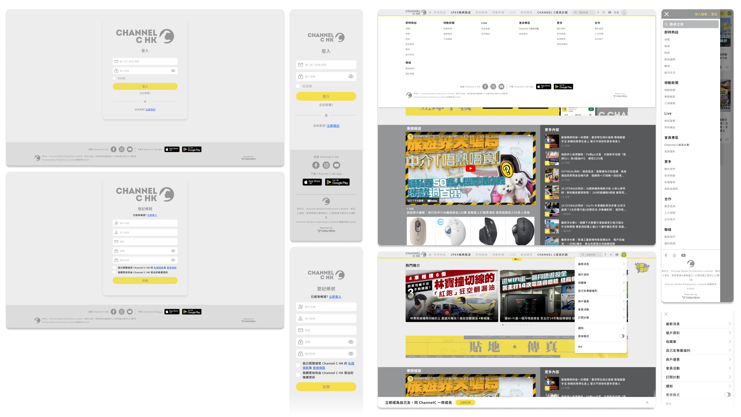
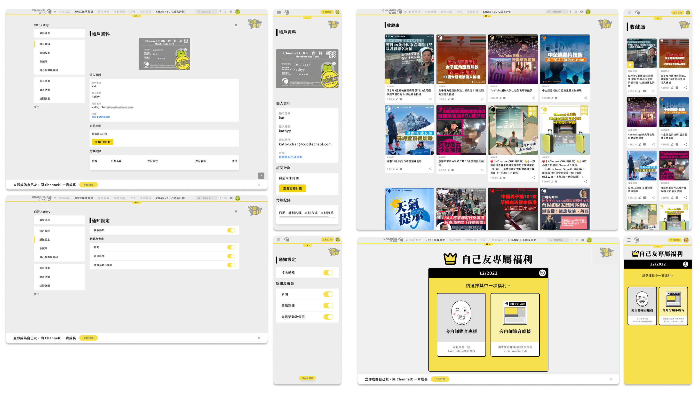
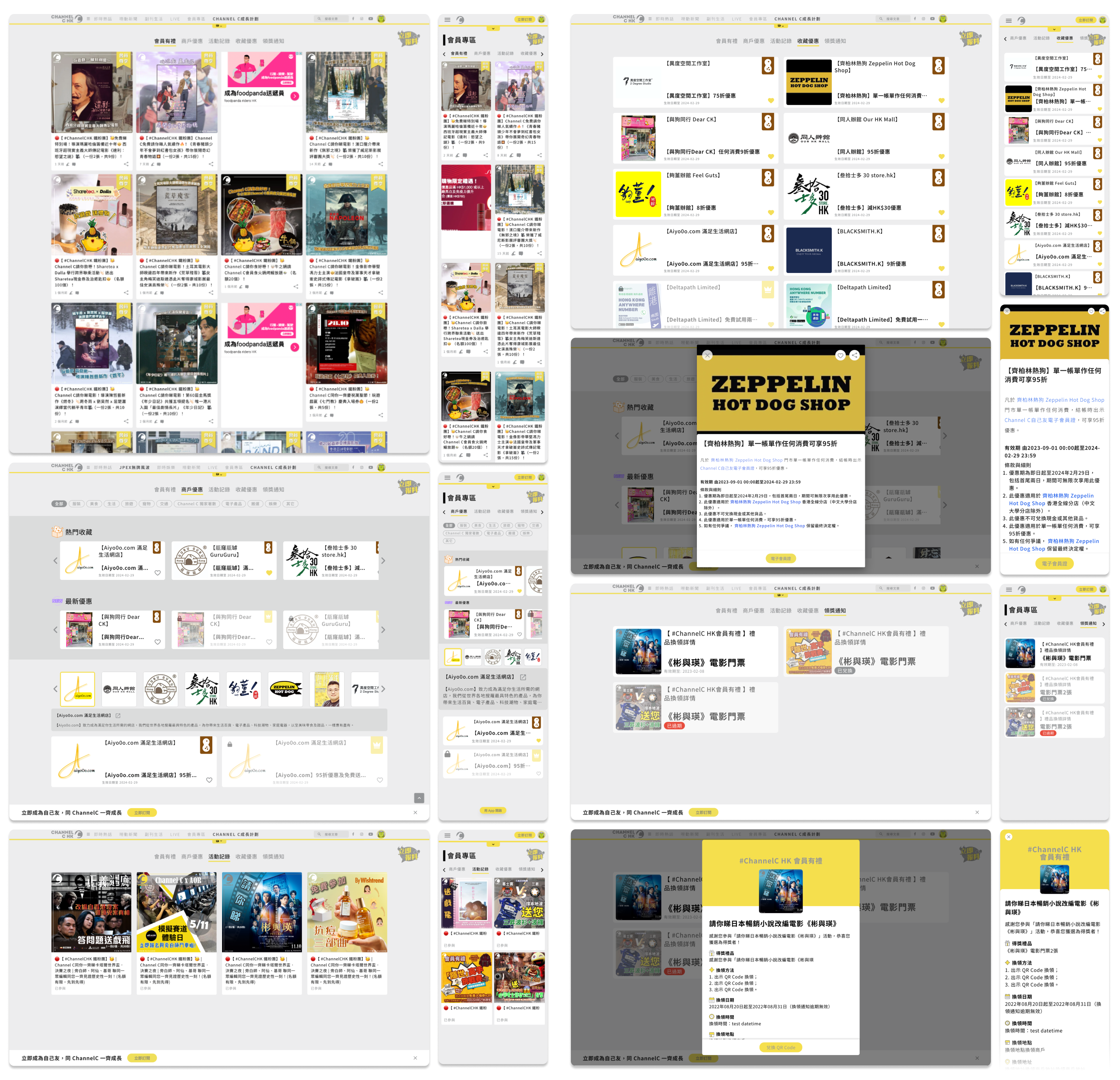
Apart from the Homepage and News Articles, the UI of other pages has also been revamped to improve the user experience and align with the brand identity.
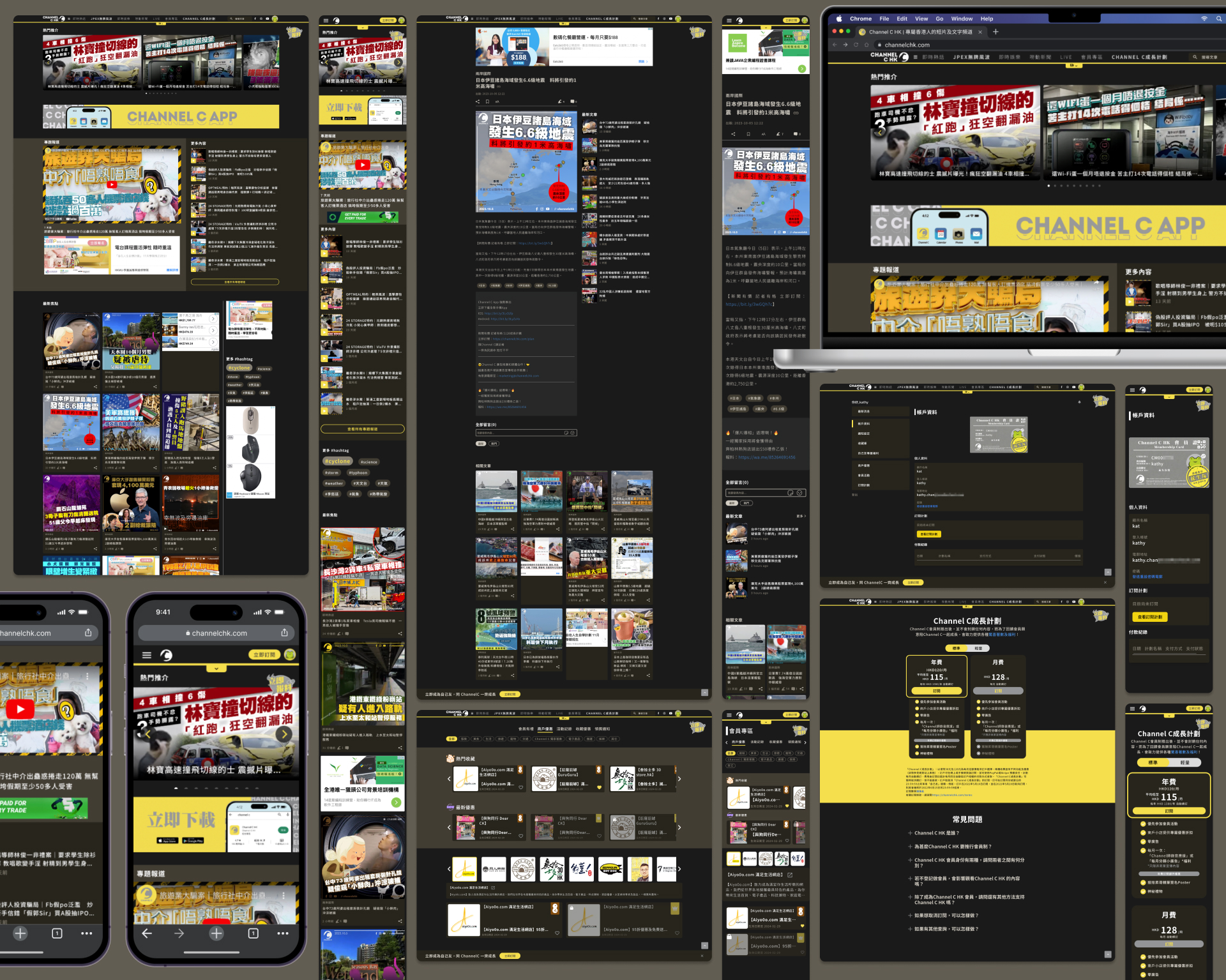
Dark Mode –
Mobile App

Desktop / Mobile Website
Reflection –
Overall, the website and mobile application successfully addressed the pain points of Channel C HK and provided an engaging platform for their audience. However, continuous improvement is essential to ensure the platform remains up-to-date and meets evolving user expectations.
Future enhancements might include:
Enhanced personalisation: Offering more advanced customisation options to tailor the news feed precisely to individual preferences.
Social interaction: Integrating social features to enable users to engage with other community members, such as notifications from comment on articles, and participate in discussions.
By incorporating these improvements, the website and mobile application for Channel C HK can further enhance the user experience and maintain their position as a leading online news media platform.